INFO 200: Intellectual Foundations of Informatics, March 2021-June 2021
- Summary
- Problem Overview
- Specific Role
- Initial User Research
- Architecture & User Journey
- Brainstorming
- Mock-ups & Prototypes
- Design Evaluation & Feedback
- Learning Outcomes
In an informatics class, we worked in pairs to redesign an existing website or app as a final project. Our chosen website, UW MyPlan, is how every UW student plans their schedule and registers for classes, or audits their degree plan to see if they’re on track to graduate.
Summary
With a partner, I worked to assess UW MyPlan for usability and redesign parts of it to prioritize the user: allowing for better degree planning and ease with course registration. Our user journey centered on a first-year trying to plan a schedule for the following quarter, where we identified additional improvements that could be made in planning flexibility and a potential new feature (which was not within the scope of the project). From this, we sketched possible new screens and then created a prototype addressing registration inequity and planning for future quarters. We assessed our design for potential flaws and got feedback from a few classmates. Overall, I learned how to use Figma and work in a team to address issues with complicated solutions.
Problem Overview
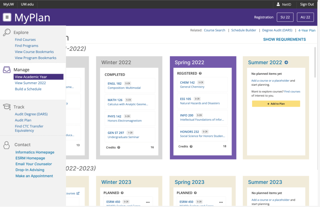
UW MyPlan is a tool for students to search through available courses and add them to a plan. However, unless students are already familiar with how to use it, a lot of the information is scattered in different places. The main problems my team targeted included:
- Inequity in registration: people with the fastest internet get priority registration for all classes, while students with slower computers may not get their request processed before classes fill up
- Lack of graduation information: major graduation requirements are only available on department websites, or through the “degree audit” feature (which is in a completely different place from the rest of the course planning functions)
- Faulty four year plans: currently, no functions prevent students from planning classes before meeting prerequisites, or placing classes in quarters where they aren’t offered.
- Scattered information: a user’s visual schedule is multiple clicks away from their planned course list, and course summaries are only available on the course’s page.
Specific Role
Because this was a partner project, both of us participated in the design process. I did all mock-ups on Figma based on our brainstorming sessions. I also did most of the design justification in our final paper.
Initial User Research
When interviewing classmates on their experience with MyPlan, many really valued the degree audit feature and were opposed to changing it too drastically.
Many underclassmen expressed interest in better future planning features, as several first-year programs ask students to build a four year plan. Most of the students interviewed were using a different program for that: mainly Excel or Google Sheets, because it allowed for more flexibility in moving classes.
Classmates from all grades showed frustration with the registration process and not getting into classes they want.
Architecture & User Journey
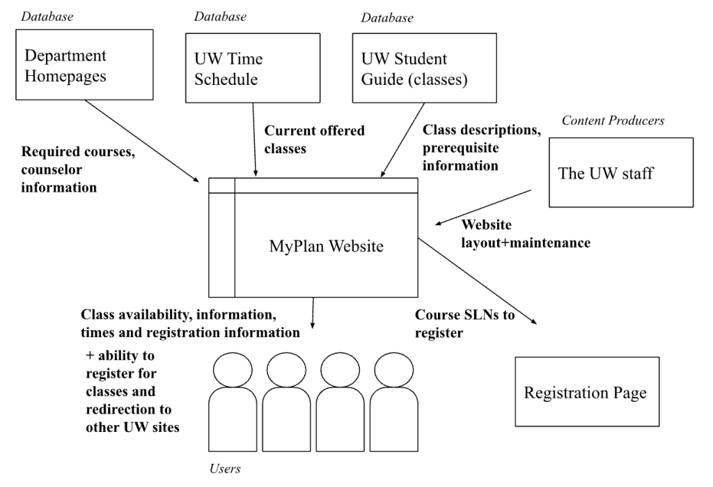
To better understand what we were dealing with, my team constructed an architecture diagram to determine how MyPlan users were receiving information. Because it comes from multiple different places that rely on people updating them regularly, we ran the risk of displaying outdated information.
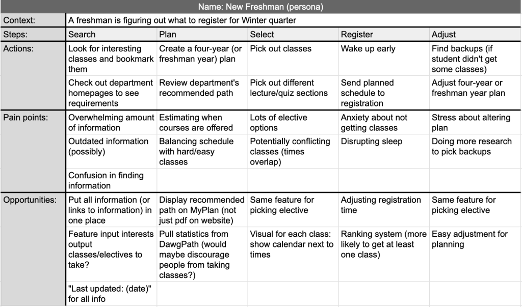
We also created a user journey for a freshman trying to register for winter courses. This allowed us to identify pain points and then opportunities for features we could implement. From this, we identified a potential new project to better the registration experience: a place where students can input their major/requirements and their interests, which then recommends an elective based on that information. However, this was deemed too complicated for the task at hand and would possibly be expanded on at a later date.
Brainstorming
Because of the variety of majors, offerings, and student paths towards graduation, having advisor information and links to department homepages seemed vitally important. Our first sketches had counselor information displayed prominently.
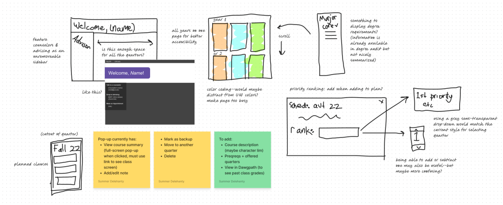
We considered how to display a four year plan and degree requirement information. We also considered how to show course descriptions more easily (which we ultimately decided to include in a pop-up) and how a student should rank a class.
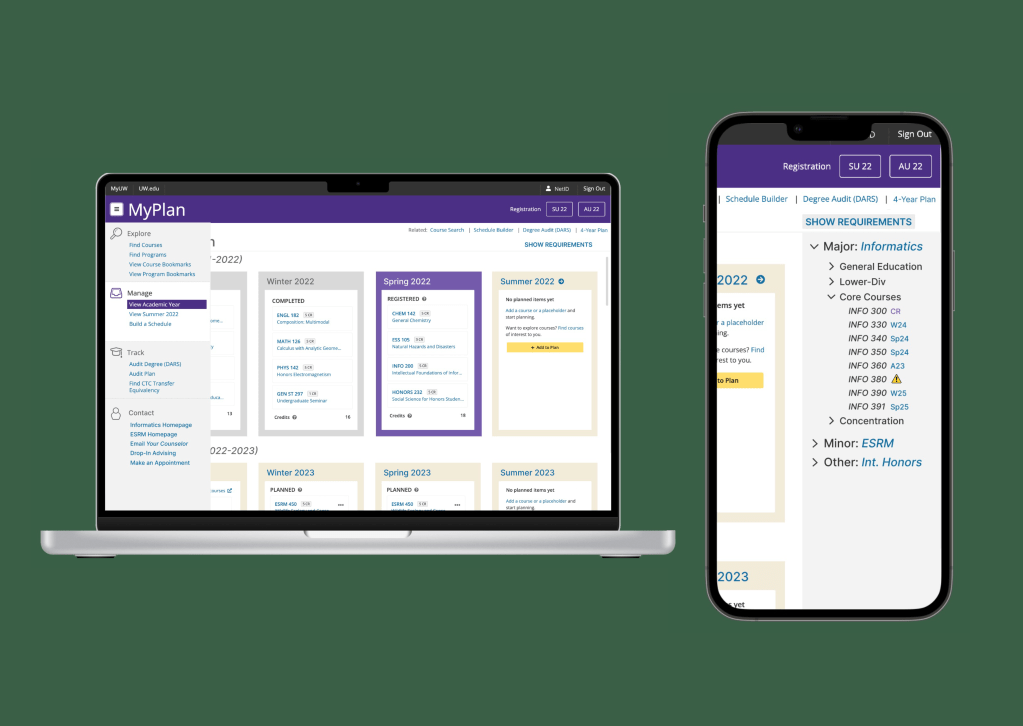
Mock-ups & Prototypes
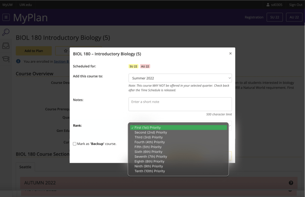
The first thing we addressed was registration inequity. To keep things fair, all students must rank their classes by priority: that way, class requests are sent in one at a time. This keeps servers from crashing and makes the likelihood of a student getting into at least one planned class much higher, so students with poor internet don’t suffer.
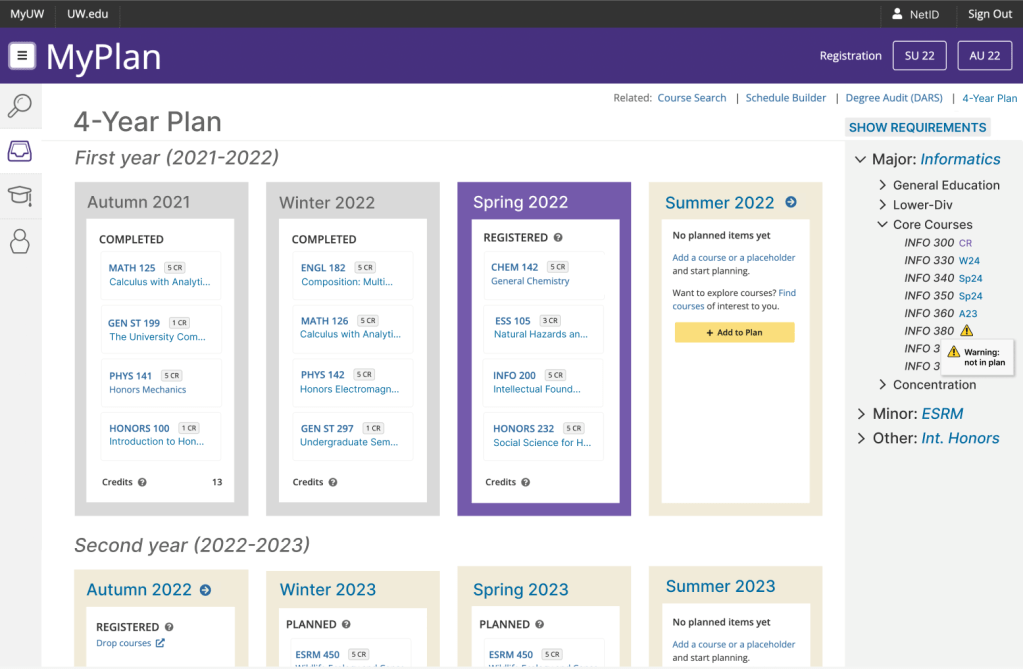
We also pulled information from several pages and condensed it into one. The new schedule viewer shows all years of undergrad on one page, to make planning easier. It also displays class requirements from the degree audit page in a sidebar, so students don’t have to switch back and forth between screens. Just like the degree audit, it gives warnings when students have a class missing from their plan.
So users don’t have to open up the class page to see the description, it’s now available from the meatballs menu as a pop-up. This is for the convenience of students working on their graduation plan, who may not have the course numbers memorized but want to ensure a balanced schedule.
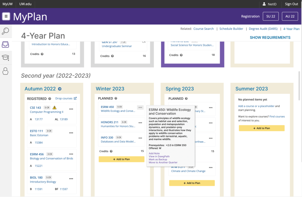
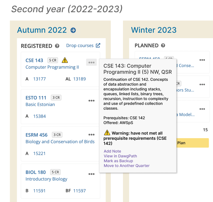
Pop-ups will also feature smart suggestions, warning students if they don’t have the proper prerequisites to take the course when planned.
And finally, though not displayed as prominently as the initial drafts, all counselor and department homepage information is accessible at the bottom of the main menu for easy user access.
Design Evaluation & Feedback
Our new design provides easier access to advising, giving students the resources they need to plan their schedule and progress towards graduation. Plus, because more information is in one place, it’s easier for new students to learn how to use it. Classmates especially liked the degree requirements sidebar during critiques. However, we were also able to come up with a couple unintended consequences of our new design:
- Lack of flexibility in four-year plans: users are only allowed to have one four-year plan. If they’re deciding between majors, minors, or even slightly different tracks in a major, they have to record the differences somewhere else. There’s no way to bookmark and compare their different plans, and switching between them means completely redoing the whole four years.
- Potentially misleading information: as comprehensive as it is, a website can’t take the place of counselor advice who are most familiar with the majors. Users may try to figure everything out themselves, possibly missing important elective classes that an advisor could recommend based off intended career paths and interest.
- Outdated information: although this is also a problem with the current MyPlan, showing more class information means featuring more information that may become outdated. If students aren’t frequently updating their four-year plan, they may miss changing requirements or not notice if a class is no longer offered during a quarter.
Learning Outcomes
This whole process gave me an introduction to user experience and modifying designs to solve problems. Because my other experiences have been individual, it also taught me about designing in a team: both the benefits (such as additional insights and task delegation) and drawbacks (such as working through differing opinions).
Most importantly, it helped see the limitations in design. Users oppose significant change, as they’re often used to the old system and therefore don’t want to learn to use a new one. Plus, design is subjective: when getting feedback on our redesign, not everyone was satisfied–and what some people loved, others hated. Although we couldn’t perform usability tests on our mock-ups, this project introduced me to UX/UI and some common design tools and practices.
