Summer: Native Food Festival
Summary
- Who: Just me (solo project)
- What: Imaginary food festival focused on native and sustainable foods
- When: Fall 2023, 10 weeks
- Where: “Visual Communication in HCD” at UW, Seattle
- Why: To explore different aspects of design, from branding to user experience, and to gain experience with following the design process
Contents
- Background
- Branding
- Physical Artifacts
- Mobile App Component
1. Background
This was a quarter-long, individual class project that focused on all aspects of creating a three-day festival on the UW campus, from branding to mobile interfaces. The first assignment involved defining what we wanted our food festival to be and why people should attend – or creating a “Core Value Proposition.”
Core Value Proposition and Unique Selling Point
Although other local food festivals exist in Seattle and in most major cities, I explored the idea of what it means to be “local” vs “native.” I decided to highlight what makes the Pacific Northwest unique: such as the culture of the Coast Salish tribes and presence of certain wild plants, like huckleberries. I thought this would target both Seattle locals looking to show off their Pacific Northwest pride, as well as tourists exploring a completely foreign area, especially incoming college students and their families.
My Unique Selling Point is that my festival highlights Native American cuisine and culture, unlike other food festivals that focus instead on local restaurants and farmers with foods from all parts of the globe (even though it’s locally produced).


Competitor Analysis
I researched three other food festivals: one local Seattle festival, another sustainable Seattle festival, and finally a local festival in Boston.
My main takeaway was that Seattle has a festival for local restaurants and a festival focused on sustainability, but nothing focused on Native American cuisine combined with local eating.
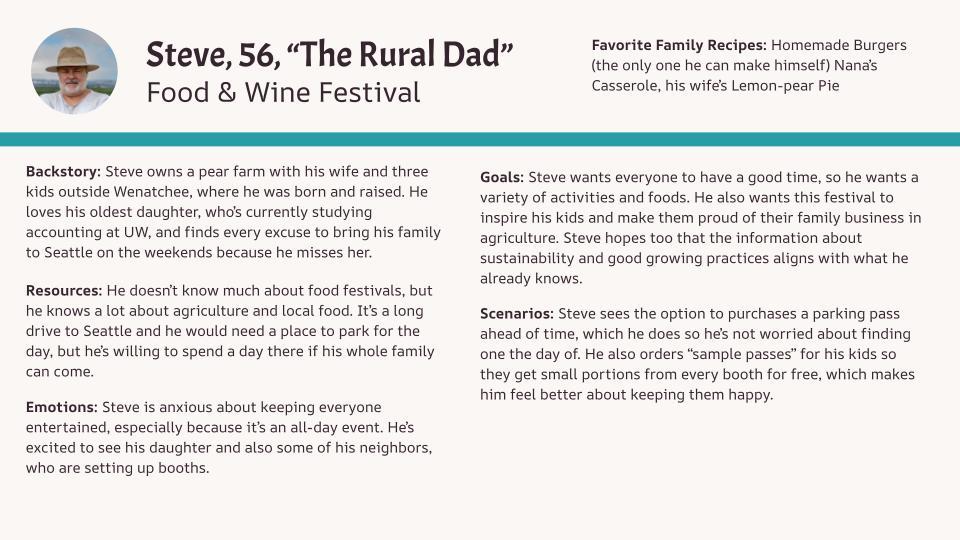
Personas
I created three separate personas (shown below), trying to target all potential demographics: college students, adults in their mid 30s, and families with young kids. I gave everyone a backstory, then identified what resources were available to them in terms of prior knowledge and access to information. Finally, I brainstormed what their emotions and goals were for this festival, and thought of a scenario relating to them attending.
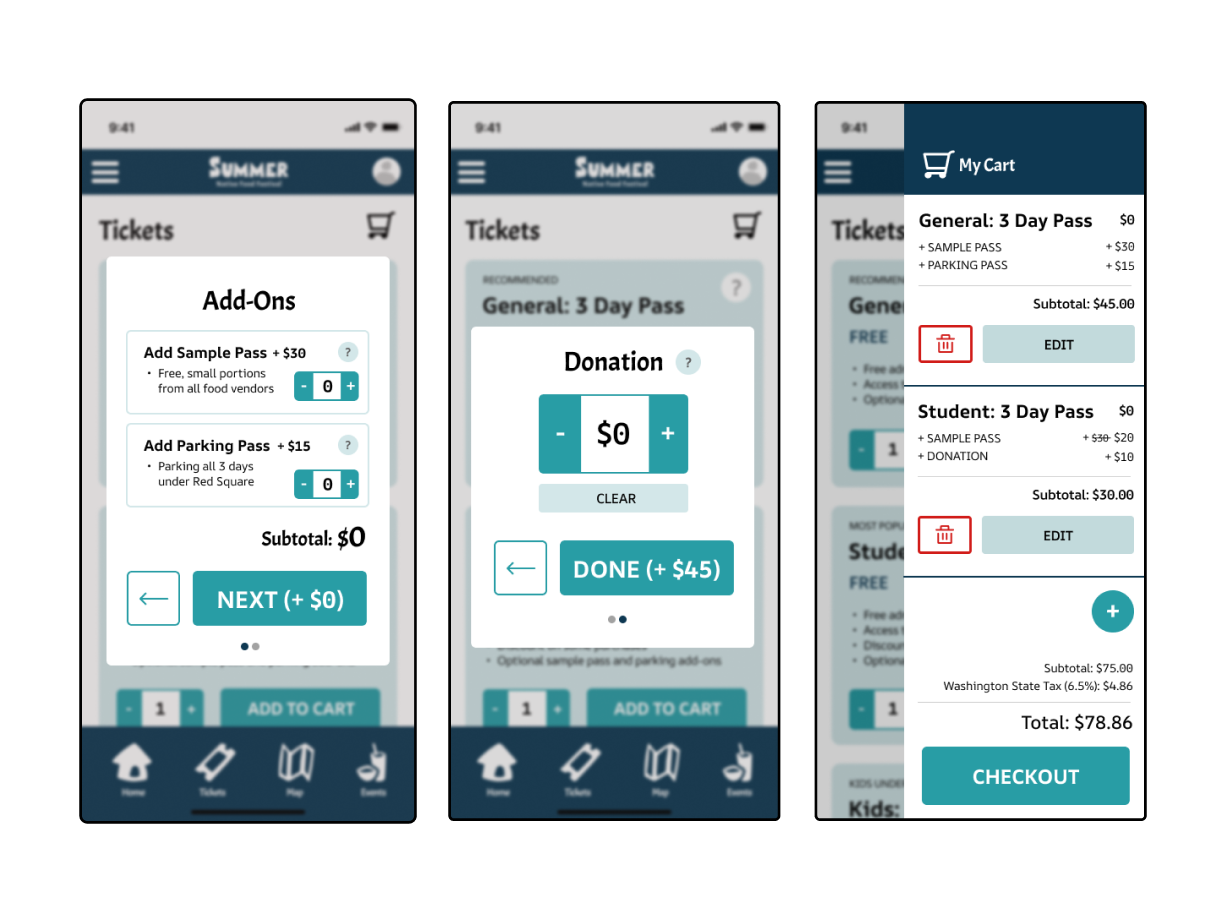
My main takeaways from this were to find ways to entertain and support all age groups. It helped me determine what sort of events to offer, and how to structure ticket pricing and parking. In order to appeal to more people (especially college students), general admission is free, but there are optional add-ons (such as sample passes and parking passes) for people who are willing to spend more money, mainly older adults with cars, kids, or a huge interest in the festival.
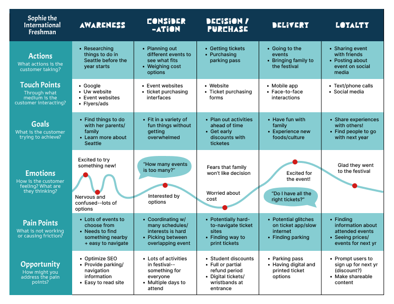
User Journey
My customer journey targets my first persona (the college student). From awareness/discovery to attending the event/loyalty, I pinpoint her actions, touch points, goals, emotions, and pain points, and finally ways to improve her experience at each step.
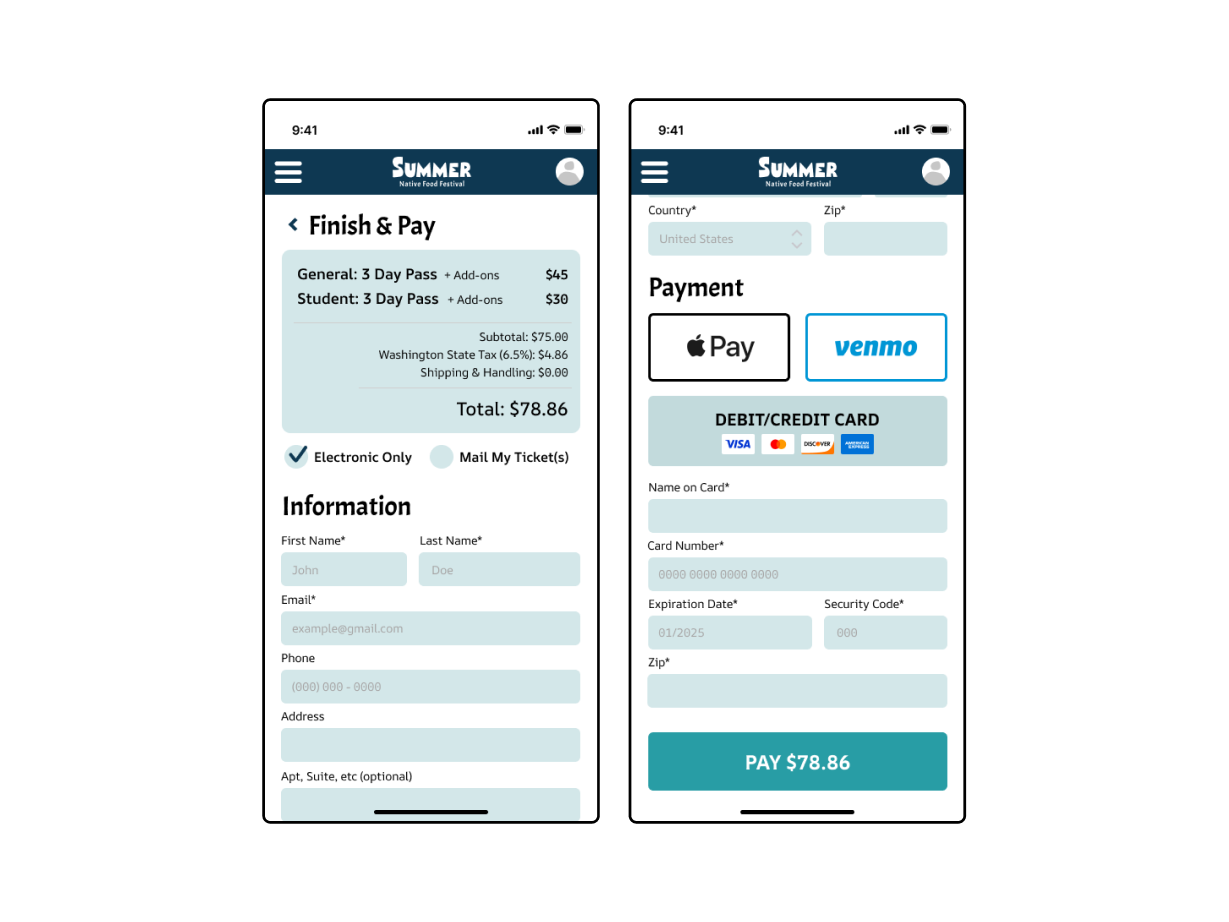
From here, I validated my takeaways from the persona creation, such as the use of parking passes. I also incorporated some new features, like a student discount to encourage student attendance, and a mobile ticket component to allow attendees to choose between a digital or physical ticket.


2. Branding

Wordmark
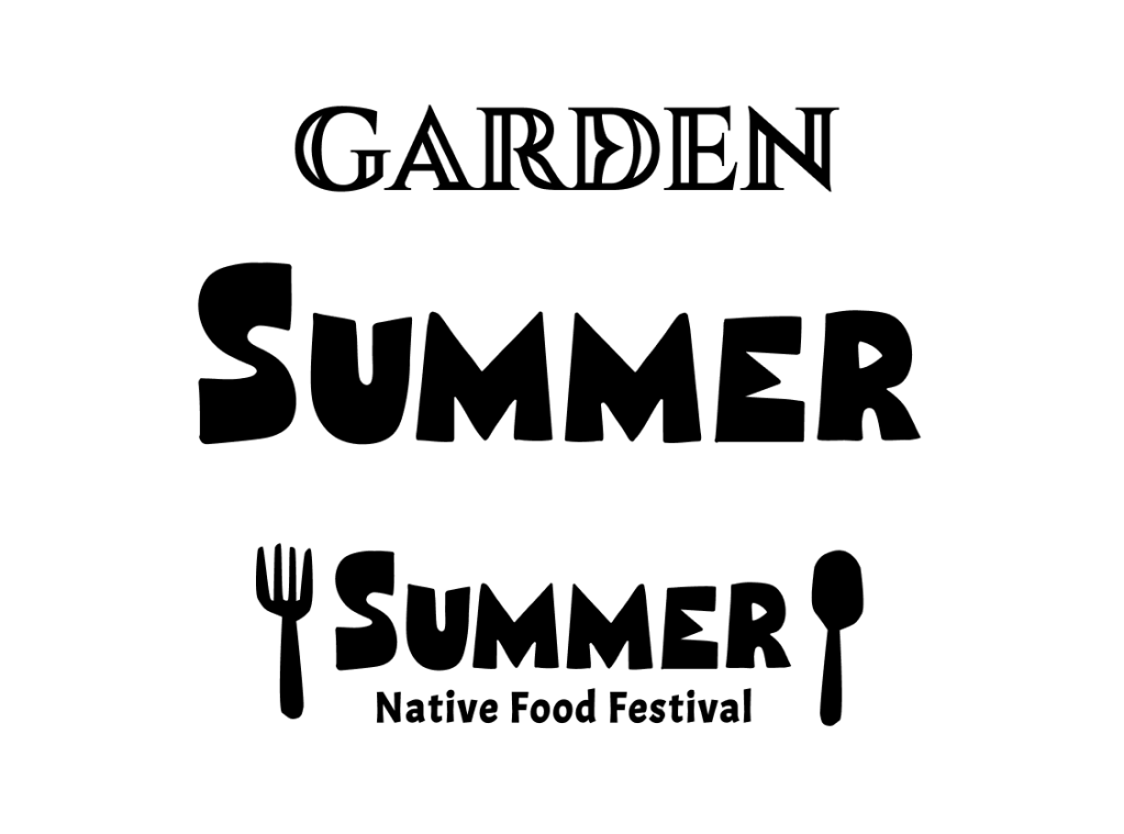
For my wordmark, I had two potential directions that I brought to class critique. The first was to use an elegant, serif font with hollow decals reminiscent of Coast Salish artwork (“Garden” at the top), and the second was a sans-serif, blocky font with uneven lettering and sharp edges that felt more “rugged” and natural (“Summer” in the center). I also had two assigned words to choose from: Garden or Summer.
I ultimately decided that the blocky font was more representative of my festival as a whole being about the Pacific Northwest. Seattle is associated with views of Mt. Rainier, the Cascades, and the Olympic mountain range, which is evident in the jagged points of the Ms. My festival is also about the locally grown and the handmade, which is why I liked the imperfect lettering, as if drawn by hand.
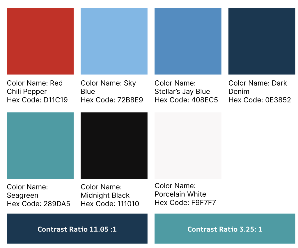
Colors
Because I opted against the serif font for my wordmark, I wanted my colors to be a nod towards Coast Salish culture. Often, their artwork is done in black and white, with highlights of red, teal, and blue: leading me to this palette.
I made sure all contrast ratios met WCAG Level AA guidelines, yet throughout the class I noticed accessibility issues with red: it doesn’t stand out in the same way to red-green colorblind people as it does to everyone else, and they make up roughly 9% of the population. Although I kept it in the palette, I was mindful of that and used it very sparingly.

Icons
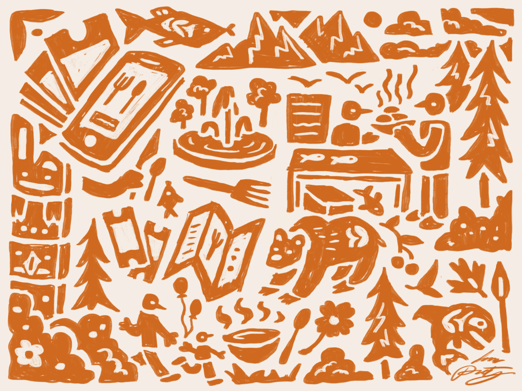
I designed five icons to use throughout my project, keeping the same irregular and blocky feel of my wordmark.
I shaped the “home” icon to feel more like a cozy hut, rather than a typical house, as a small detail. The fork & spoon was originally for “food,” but I decided to use them elsewhere instead.
During class critique, I got feedback that my original ticket icon looked like a candy bar, so I changed it to have smooth, notched edges instead.
3. Physical Artifacts
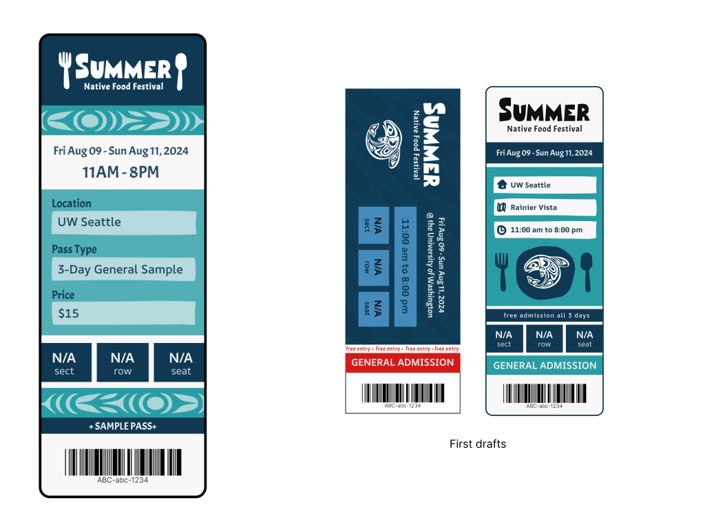
Ticket
For a physical ticket, I used the standard Ticketmaster size. I included all the basic information and a barcode, focusing on color and general aesthetic for the people who would want it as a souvenir.
The class preferred the vertical version, and in my second iteration I changed some of the straight lines to be jagged like my wordmark. I incorporated some Native American art and icons for visual appeal and to make it obvious what the ticket was for at a glance.

Infographic
Most of the statistics on my infographic are based on actual data: I made my classmates take a survey about how many Coast Salish tribes they could name, how they would (hypothetically) get to the event, what activities they were most excited for, and whether or not they would purchase a sample pass. I did have to make up attendance numbers.
I wanted to highlight that, despite there being 12 Coast Salish tribes and five in the UW Land Acknowledgment, the average attendee could only name 1.6. This demonstrates a clear need for this festival to raise awareness and help students learn more about the area they live in.

Map
My map displayed all important venue and event information, with a reminder of the dates. I used the shape of NE Pacific Street as an edge to my map, rather than a typical square, because I wanted to play with shape irregularity more than I had in other designs. I adjusted the colors in my second iteration to break up my use of white backgrounds.

Signage
I created an example of an A-frame sign that might be around the festival grounds to help direct traffic. Given that the festival is outdoors, it made the most sense to have freestanding signs rather than posters for a wall. While I also played with shape irregularity here, I ultimately couldn’t get the spacing to work with the arrow boxes.
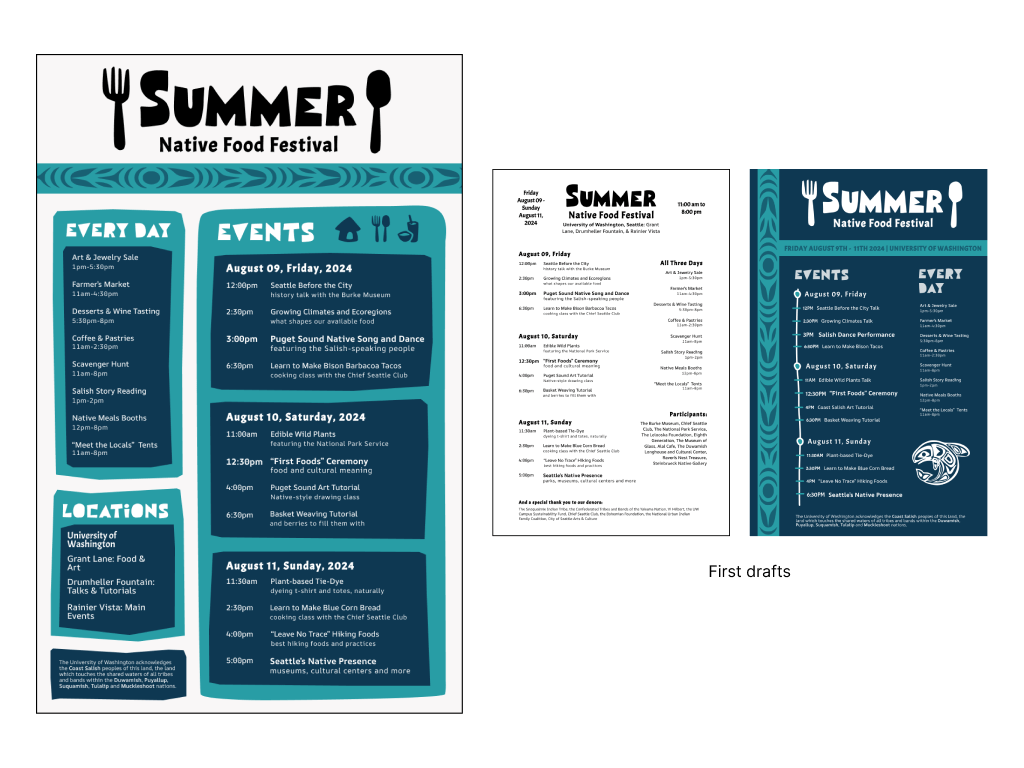
Poster
The poster was the hardest task for me, and something I revisited several times throughout the quarter. I couldn’t figure out how to format all the necessary information without making it too cluttered, as I felt that there were too many things I wanted the poster to say. This specific assignment is what helped me realize that I prefer interactive design over graphic design.
4. Mobile App Components

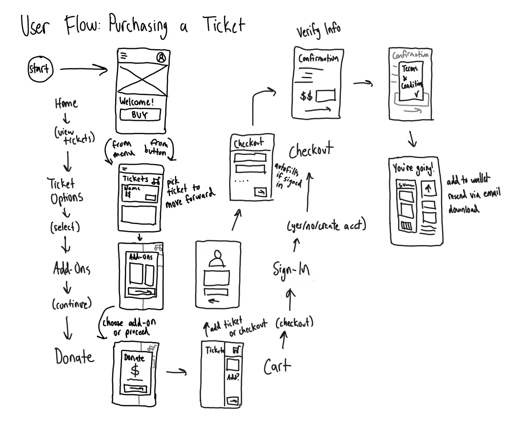
User Flow
I created two separate user flows (one as an assignment, and the other to get a better sense of where to take my designs). I first figured out how everything would be formatted and in what order all the steps would come in. Then, I sketched wireframes at different points in the process.
These hand-drawn wireframes are something I do for all my designs, whether it’s digitally on an iPad or physically on pen and paper. I think better when I can sketch out all my ideas and annotate them without having to worry about formatting or wrestling with software.
Initial Wireframes
My main goal with this aspect of the class was to create a streamlined workflow allowing users to purchase a ticket with all the desired add-ons WITHOUT overwhelming them or causing them to feel trapped in the purchasing process.
This was my first experience designing a digital interface without predefined styling. I jumped straight into a higher-fidelity wireframe because I knew I’d want feedback on styling in addition to interactivity. I used the fonts and colors of my festival to see how they would come together in mobile interface, noting where fonts were hard to read and where color made things busy.

more coming soon…
