personal project, summer 2022
- Project Overview & My Role
- Initial User Research & Archetypes
- Journey Map
- Concepts
- Wireframes & Prototypes
- Drawbacks and Limitations
- Outcomes
For amateur and seasoned birdwatchers alike, eBird and Merlin BirdID—two apps released by the Cornell Lab of Ornithology—are essential for any outing. Merlin BirdID provides visual and auditory identification clues, while eBird collects bird “checklists” and displays real-time bird sighting data. I use both, yet found the mobile version of eBird was hard to navigate and didn’t offer the same features as the eBird website. To familiarize myself with Figma and gain more practice with UI/UX principles, I decided to prototype the app as a personal project.
Project Overview & My Role
The main function of eBird is to allow users to keep track of all their sightings. Checklists are where users can record data such as species, number of birds, location, distance, duration, and other comments/observations. Because checklists are public, other users can see updates for popular birding locations: especially useful for out-of-the-ordinary birds other people might want to look for.
As a passion project, I worked alone. I conversed with other birdwatchers I know to help guide my design process and to figure out what problems I wanted to address.
Initial User Research & Archetypes
When identifying adjustments I wanted to make, I compiled information from several conversations I’ve had with other birders: using both specific conversations about eBird as a tool and general conservations about birding. I was able to generalize people into two rough categories, and then listed traits of both to create two archetypes. I could then identify overlap in what they might want to see, and what might benefit one group but not the other.
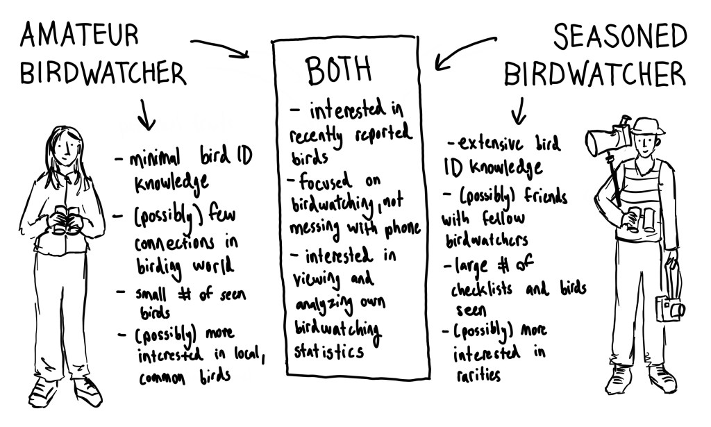
From these traits, I gathered what functions the app should perform and what should be included:
- Pictures and links to Merlin BirdID (to assist with minimal bird ID knowledge)
- Visible comments, shared checklist features (to build and maintain connections in the birding world)
- Checklist organization and statistics (to allow users to analyze their birdwatching over time)
- Simple interface with easily identifiable categories (to minimize time spent searching for important features)
- Rare and common bird sightings within area (to provide current bird sighting information)
Knowing that eBird is a widely used and respected birdwatching app, I also brainstormed what might prevent these changes from being implemented. The main challenges I identified were:
- Data Volume: Merlin BirdID and eBird both hold tremendous amounts of information, which is why they’re split into two apps. It’s important that eBird runs quickly and smoothly, so figuring out how to organize all the user data was tricky. Plus, I didn’t want to add too many new features that would take additional time to load.
- False Reporting: eBird reporting data is highly regarded in the scientific world and used to inform conservation decisions, especially when official studies would be too costly or difficult to execute. For example, laws affecting wind turbines are adjusted based on eBird reports of eagles near turbine sites. It’s important that changes to the app interface don’t encourage false reporting, such as placing too much emphasis on finding new species or creating competition between users.
- Data Moderation: Rare birds for an area are flagged and must be “confirmed” to ensure accuracy, usually with pictures or recorded proof. The more information users can input, the more moderation is needed: so although adding messaging and commenting features is appealing, there needs to be a system for preventing inappropriate or inaccurate speech.
- Consistent Branding/Style: eBird is very popular, so adding too many changes is likely to frustrate and discourage users who are used to an old design. As I designed, I tried to minimize major changes and keep important features similar or the same.
Journey Map
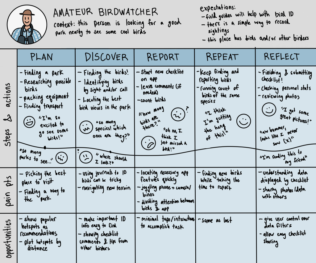
Rather than a typical customer journey focused on the user discovering the product, I drafted one about a current user to identify where improvements can be made to keep them as a loyal customer.
I decided to expand on the amateur birdwatcher archetype, because they would likely need a lot more guidance and resources than an experienced birder. I wanted to make sure the app addressed everything they might need to keep them from seeking other birdwatching resources. Throughout their journey, I identified their actions, emotions, and pain points: which highlighted a few more features to consider implementing, like hotspot recommendations or featured checklist comments.
Concepts
I started sketching some ideas about what I thought the new interface should look like. I went off of the current structure, so the overall feel of the app was the same.
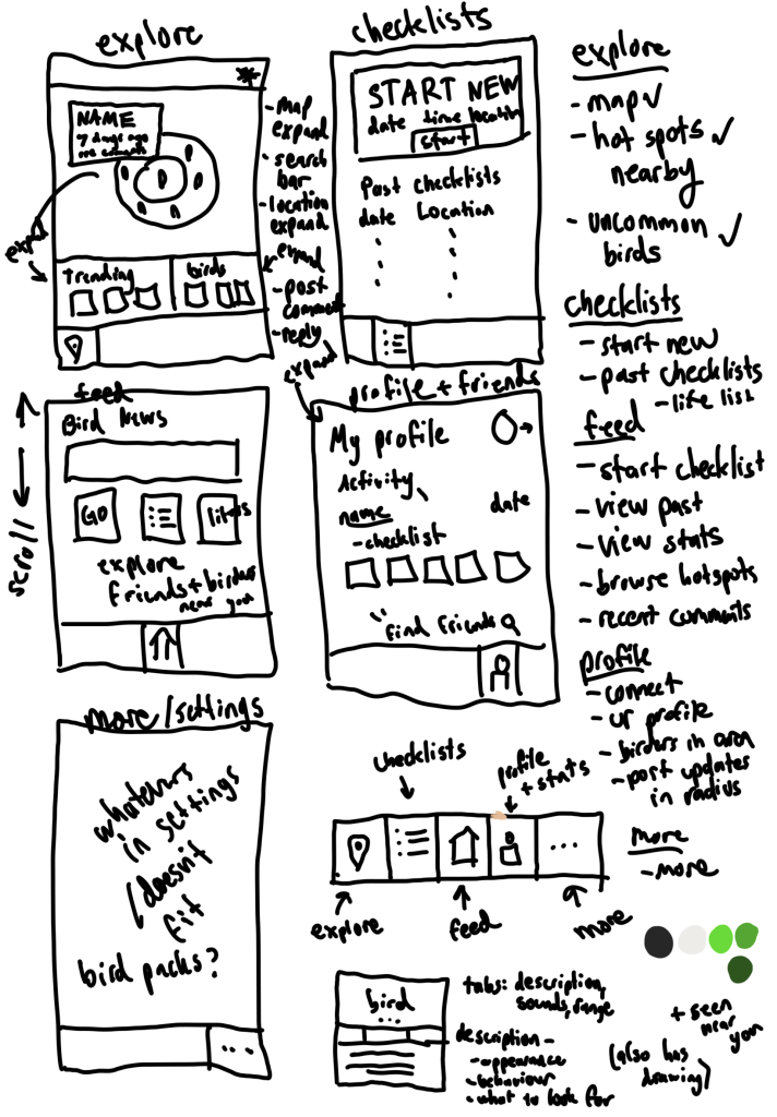
To assist new birders or long-time birders with a network of birdwatching friends, I played with several ideas on how to display friends’ activity. I added a couple features under the profile/stats screen to display friend’s recent checklists. Although I contemplated allowing users to create their own posts relating to birds, that violated three of the four main challenges I identified: data volume, false reporting, and data moderation. This is also why I didn’t move forward with some of my other initial sketches, such as showing the user other birders near them.
Wireframes & Prototypes
Here are all the changes I implemented, organized into sections.
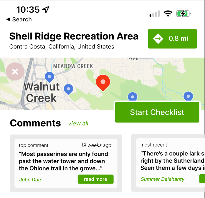
Checklist Comments
To address an amateur birder’s lack of connections in the birding world, I added a section for each hotspot that displays comments–which is existing checklist information that can be pulled directly from the submitted checklists. It might contain useful weather, trail condition, or bird presence information, and doesn’t require any additional data input. However, checklist comments may quickly become outdated or not be relevant to just any birder visiting a hotspot. In order to determine their effectiveness, user research should be conducted on user attitude towards comments and their perceived helpfulness (which is something outside the scope of a small, personal project).
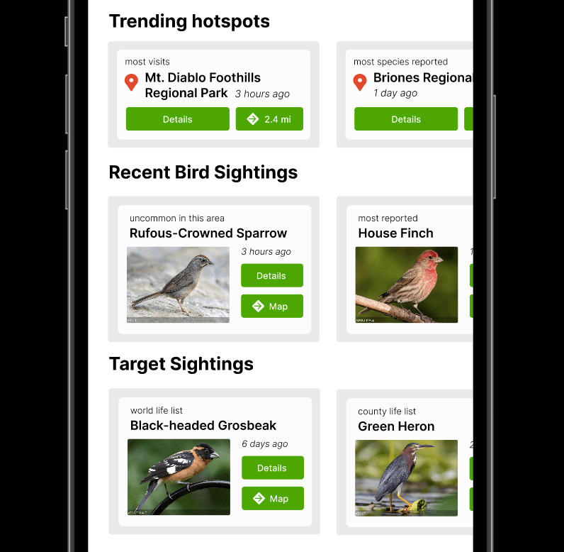
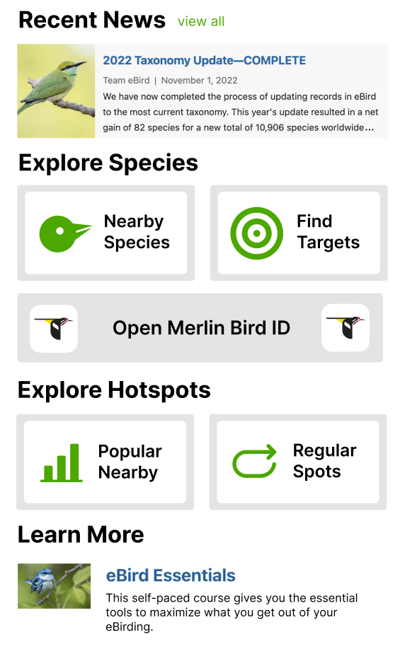
Discovering Species & Hotspots
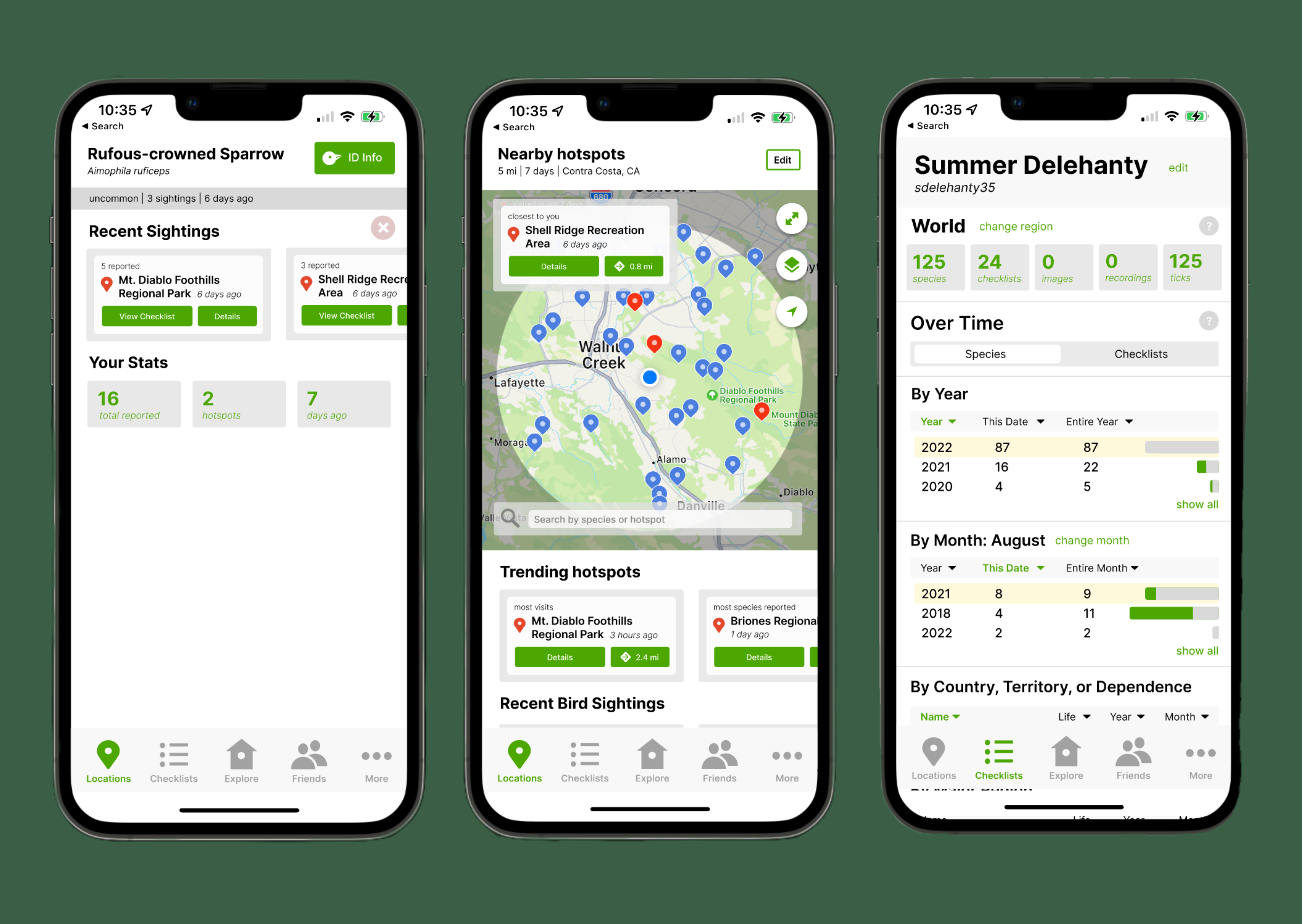
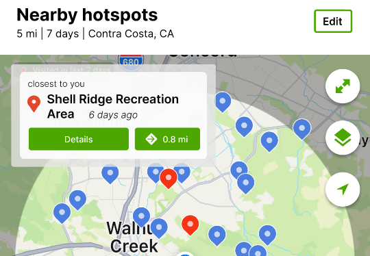
I also added cards under the map of hotspots, which display popular hotspots, recent bird sighting, and target sightings. Each card shows relevant information (such as name and distance) and allows the user to view more information. The current eBird doesn’t show any list of trending hotspots, and currently species and targets are in a plain text list. Although that’s also available, the cards display especially notable birds (such as the quail, which has more reports than usual) and three target species with pictures.
Additionally, the closest hotspot is now displayed as a card in the top corner of the unexpanded map.
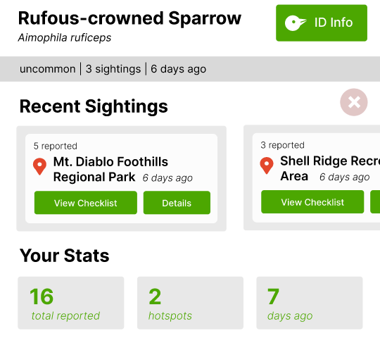
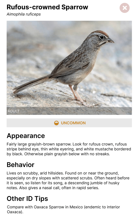
Pages for a specific species also has more information. It links to Merlin BirdID to show identification info, especially useful for new birders that may not have all the species memorized. It also shows a list of recent sighting locations and your statistics surrounding this bird, which isn’t currently available on the app. Note that the existing app also shows a map with pins on the species sighting locations, but because I had no modifications to make I didn’t prototype that part.
Merlin Bird ID
Because Merlin Bird ID is closely linked to eBird, I redesigned a single screen: organizing the bird ID information into sections, so users can locate what they need faster. This was also to demonstrate how eBird should redirect to Merlin, which keeps amateur birdwatchers from struggling to find the species in both apps. However, I kept the rest of my focus on eBird.
Friends Features
To encourage building friendships through birding, users can now become “friends” and see each other’s recent activity: such as recent lifers (new species sightings) and checklists. I made sure to de-emphasize names and not use any like/comment features, which would encourage user competition and potentially false reporting.
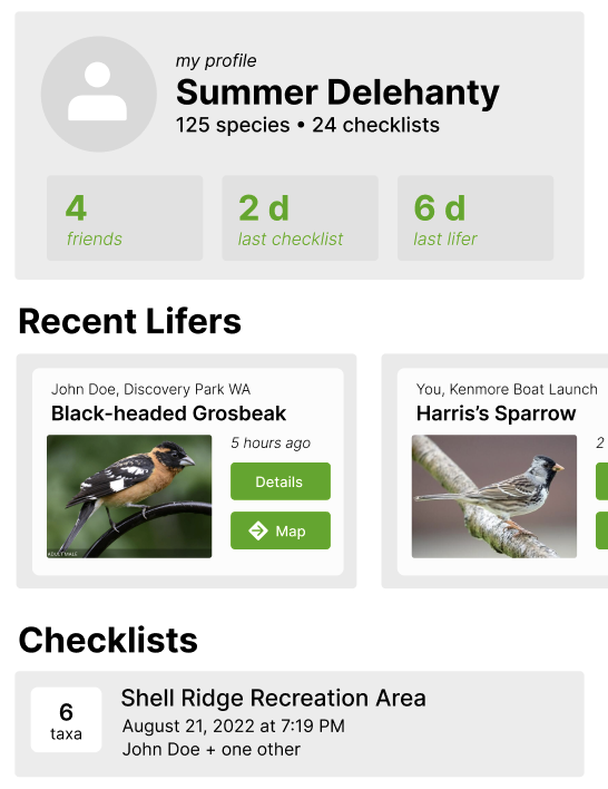
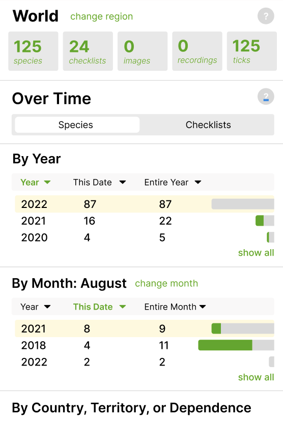
Birder Statistics
In addition to viewing friend statistics, users can now see their full statistics as they can on the eBird website. The “?” buttons give more information for amateurs, which appears as pop-ups instead of a new screen (which is how the explanation currently appears)
Information from Website
The “explore” screen incorporates other features available on the website but not the app, most notably news articles, birding classes, and “finding targets” (which is just another way of displaying targets in a given county or radius). It also encourages users to open Merlin, which contains other useful features from the website.
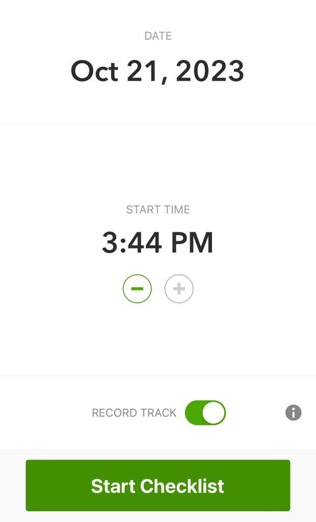
Submitting and Viewing Checklists
While the current eBird has “start checklist” and past checklists on different screens, my mock-up combines the two onto a single screen to save space. I condensed the “start checklist” button to reduce unnecessary white space and group all checklist information together.
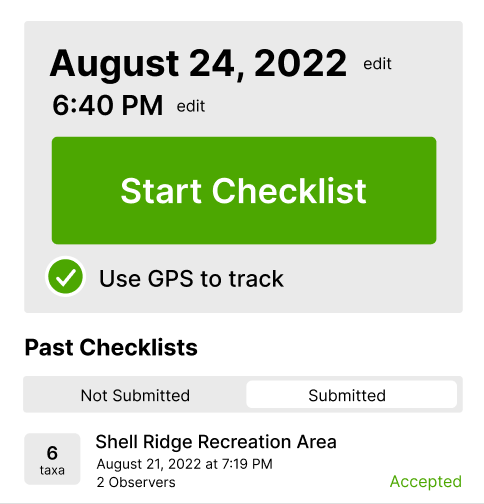
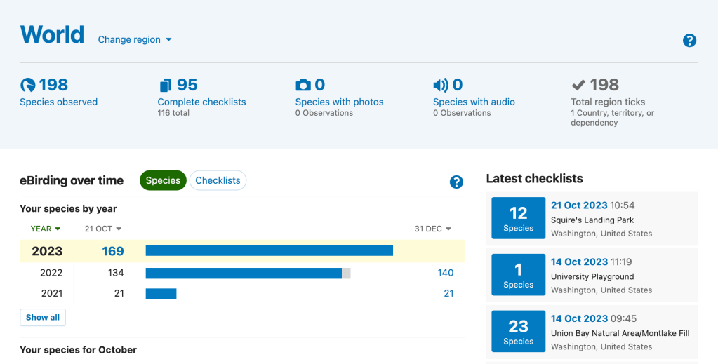
Compare to the current eBird design:
Drawbacks and Limitations
Currently, eBird’s “explore” screen is what I have as my “locations” screen. If my design were to be implemented, this would likely confuse users until they got used to the change.
Additionally, although I attempted to address false reporting, there’s always a risk that competitive birders will falsify reports. If a group of friends is especially competitive, displaying friend activity will only enable this.
Finally, in order to focus my attention on specific features, I did ignore some elements of eBird. Currently, users can’t upload photos through the app (they must use the mobile or desktop version of the website), which is something I didn’t address in my design.
Outcomes
This project, although done informally, taught me a lot about identifying problems and designing to overcome them. I had lots of ideas I had to scrap because of their unintended impact, such as encouraging false reporting.
Although I’ve worked with Figma for class, this project gave me the freedom to experiment with it as a modeling tool. I learned different elements of prototyping, from overlays and pop-ups to scrolling. I also became more familiar with the interface and learned how to create designs more quickly and efficiently.
